Some Extra Nerdy Stuff




This game was such a joy to make!
I want to say it was about a year ago that I asked myself the question: "what is the smallest meaningful way I could represent graphics for a game?" As an Embedded Software Engineer, I'm constantly thinking about optimizing for memory space and complexity. This led to me drawing the little guy, a one-bit 4-by-8 sprite that ended up being our little guy, who would eventually in the Game Jam become You!
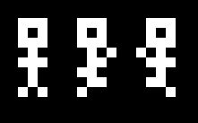
You Animations
Around this time, I also drew the sword and skull sprites. I already had the idea to have sprites be multipurpose, so you can actually see the original sprite combination for the sword had a ">" in it, which was eventually removed for the final game
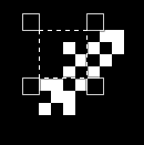
Original Sword Graphic with ">"
That one I'm really proud of, I found I could flip part of the text box sprite horizontally and vertically to form the back blade of the sword!

Textbox Borders
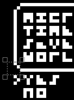
Textbox border example
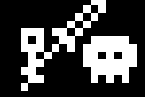
Final Sword Graphic
(There are a lot of examples of how this sort of flip-magic is used in the game, for example the numbers are almost all other letters or sprites flipped horizontally!)
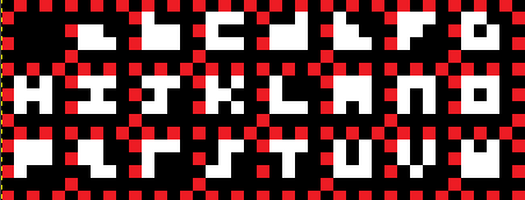
Then, to challenge myself, I tried to draw the alphabet in 3x3 spaces, so that there wasn't any overlap when lines of text were written out. Not everything is entirely distinguishable, but I'm really happy with the result, I feel like it ended up being quite readable given the limitation!
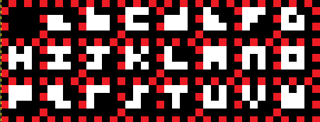
........
And after that, well, nothing happened for a while. Game Design isn't my main job, it's not even really my main hobby since I work on software at work. Music is more of a way to decompress, so Game Design feels more like honing a skill, and sometimes even feels like work itself. But when I heard this year's GMTK Game Jam theme was "Built To Scale", well, I knew this was finally the time to make this game! So I kicked back, opened Godot, and got to work.
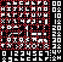
As I mentioned earlier, I'm constantly working to optimize size and complexity at work, so I applied a lot of that to my design philosophy for MicroRPG! Take the sprite sheet for instance, as I mentioned in the description, it's 8x8 4x4 pixels, or 32x32 pixels total. That's tiny for an entire game! And since it's 1-bit color depth, either 1=white or 0=black, all the graphics fit into just 32 Words (4-byte segments, also known as int32), which to me is super fun and part of what drove me to this! It did also mean I had to build a lot of the sprite displaying features from the ground up since this isn't supported innately in Godot. Each individual sprite is actually a 64-frame "animated sprite", where the byte I use to index the graphic is converted to a frame with a bitwise & operation. That means I could address each sprite with "just one byte!" It also meant I was for a little bit constantly looking back and forth between Godot and Gimp at my cheat sheet:

Cheatsheet
This gave me 64 sprites, indexed 0x00-0x3F, and -as implied in the image above- the 0x40 (1 << 6 == 64) bit would then flip the image vertically and the 0x80 (1<<7 == 128) bit would flip it vertically.
Here's where I have to confess a small lie in the description, the invert-color bit I also used in instances like the Selection menus and the Magic effects is technically a ninth bit, meaning sprites technically need two bytes. That said, I rationalized it to myself that it could technically be "one big bitfield for the entire display" which made me feel a little better. While that's technically not true because sprites can sometimes move off the 4x4pixel grid by integer amounts (or floats when it's scaled, but that's not my choice), the only sprites that used inversion were aligned with the display grid, so I'll count it as a win if you let me ;)
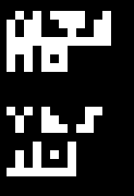
Invert Colors 🤫
........
Overall, this project has been a super fun test of my Software development skills, as well as my less-often-used artistic skills. I hoped to tell a little one-shot story with this one, and while the game ended up shorter than I originally anticipated, I am only but one dev, so cutting the scope given the time limit made sense! And this way I get to keep my sanity. I hope through this devlog that I can share with anyone who plays this game how much of a blast this was, to make something that was so truly and authentically "me" for You to play and enjoy!
If you played this game, and/or if you read this entire devlog, I can say without a doubt, THANK YOU so very much!
Get Micro RPG
Micro RPG
Save the world in One-Bit Color!
| Status | Released |
| Author | KoWalla |
| Genre | Role Playing, Action, Adventure |
| Tags | 2D, Atmospheric, Cute, Fantasy, konamicode, Pixel Art, Short, Singleplayer |
Leave a comment
Log in with itch.io to leave a comment.